
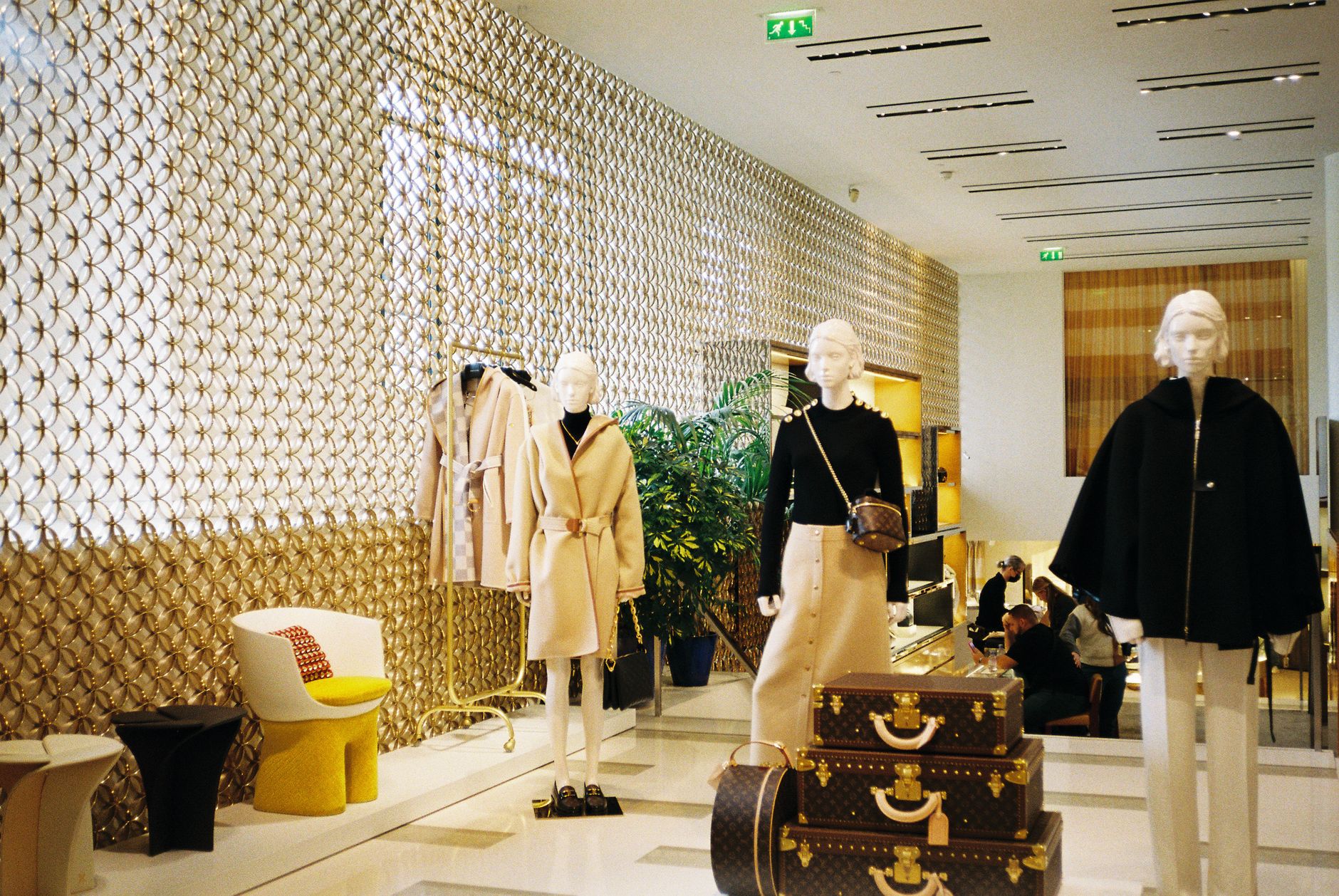
Walk into the right store and something happens before you even look at a price tag. The layout pulls you in. The display makes you reach for something. You spend more than you planned, and you don’t quite know why.
That’s not magic. That’s visual merchandising, and small business owners who understand it have a genuine edge over those who don’t.
Visual merchandising is the practice of arranging your physical space, products, and displays to guide customer behavior, boost sales, and reinforce your brand. It’s not just for big retailers with dedicated design teams. With the right principles, any small business with a physical presence can use it to sell more, attract better customers, and build a space people want to return to.
Why Visual Merchandising Matters More Than You Think
Research from the Point of Purchase Advertising International (POPAI) found that roughly 76% of purchase decisions are made in-store. Customers walk in with vague intentions and your environment finishes the thought for them. That means your store layout, your signage, and how you present your products are all doing sales work whether you’ve designed them to or not.
If you haven’t thought about it deliberately, your space may be working against you. Cluttered shelves signal low quality. Poor lighting hides your best products. A confusing layout sends customers toward the exit before they’ve seen everything worth buying.
The good news: you don’t need a big budget to fix it. You need a framework.
The Five Fundamentals of Visual Merchandising
1. The Layout Sets the Path
How customers move through your space determines what they see and what they buy. The classic retail approach is the “decompression zone” — a clear, open area just inside the entrance that lets people transition from outside to inside before they start shopping. Don’t put your best products right at the front door. Customers walk past them.
From there, guide traffic using your layout. Most people naturally turn right when they enter a space. Place high-margin or high-interest items along the right-side path. Create a natural loop that takes customers through as much of the store as possible before they reach the checkout.
For service businesses and salons, the same principle applies to your waiting area and consultation space. If customers sit facing a display of retail products while they wait, that display is selling for you without any effort on your part.
2. The Rule of Three (and Odd Numbers)
Displays grouped in odd numbers are more visually interesting than even-numbered groupings. Three items feel curated. Four feels like a warehouse. If you’re building a tabletop display or a window arrangement, use groupings of three, five, or seven.
Within each grouping, vary the height. Tall, medium, short creates visual movement and draws the eye. This works for product displays, shelf arrangements, and window installations. It’s one of the simplest changes you can make and it immediately makes your space look more intentional.
3. Lighting Changes Everything
Flat, even overhead lighting is the enemy of visual merchandising. It flattens products and makes everything look the same. Good retail lighting uses layers: ambient light for the overall space, accent lighting to highlight featured products, and task lighting at the point of sale.
If you’re on a tight budget, start with a few focused spotlights or track lighting aimed at your key display areas. Warm white light (2700K-3000K) makes most products look more appealing, particularly food, apparel, and beauty products. Cooler light works better for electronics and hardware.
Consider what your window looks like at night if you’re in a foot-traffic area. A well-lit window display after dark can pull people in even when they weren’t planning to stop.
4. The Focal Point: Give People Something to Look At
Every display, every wall, every section of your store should have a clear focal point. One item or group that the eye goes to first. Everything else should support it.
This is how you highlight your hero products, new arrivals, or high-margin items. The focal point gets the best placement: eye level, best lighting, most open space around it. Surrounding products benefit from the proximity without competing.
Window displays should follow the same principle. A great window has one clear hero. If everything is competing for attention, nothing gets it. Keep the window simple, change it regularly, and make sure it’s visible from across the street, not just up close.
5. Use Signage as a Silent Salesperson
Signage does three things: it tells customers where to go, it tells them what something costs, and it tells them why they should care. Most small businesses only do the first two.
Benefit-driven signage converts better than feature signage. “Handmade with organic ingredients” outperforms “Contains shea butter.” “Lasts 3x longer than standard” outperforms “Heavy-duty construction.” The sign should answer the customer’s internal question: why does this matter to me?
Keep your signage consistent with your brand. Same fonts, same colors, same tone of voice. Mismatched signs create visual noise that subconsciously signals a lack of professionalism, even when the products themselves are excellent. If you want to level up your brand consistency beyond signage, check out our guide on how to build a winning brand voice for your small business.
The Window Display: Your Most Valuable Real Estate
If you have street-facing windows, they are the most valuable marketing space you own. They work 24 hours a day, seven days a week, and they don’t charge per click.
A strong window display should communicate what you sell, who it’s for, and why someone should come in, all within about three seconds. That’s the attention span of a passing pedestrian.
Update your window at least once a month, more frequently if you’re near heavy foot traffic. Seasonal themes, limited-time offers, and new arrivals all give people a reason to look again even if they’ve walked past a hundred times. Tie your window to the calendar: Labor Day, back-to-school, the first day of fall. Relevance makes people stop.
Cross-Merchandising: Make Your Products Sell Each Other
Cross-merchandising is the practice of displaying related products together to encourage multiple purchases. A wine shop places cheese near the wine. A bookstore places reading glasses near the bestsellers. A barber places beard oil near the styling products.
Think about what your customers naturally need alongside your primary product and put it in the same visual field. This is a zero-cost way to increase average transaction value because you’re not adding friction, you’re just removing the gap between seeing something and deciding to get it.
This ties directly into the principle behind upselling and growing revenue without finding new customers. The physical arrangement of your store is one of your most powerful upselling tools, and it works passively.
Common Visual Merchandising Mistakes to Avoid
Overcrowding displays. More product does not mean more sales. Packed shelves signal bargain bins, not value. Give your products room to breathe. Negative space makes items look more premium and easier to evaluate.
Ignoring the floor and ceiling. Eye level gets the most attention, but customers notice the full space. Dirty floors, unfinished ceilings, or dead lighting fixtures all send signals about quality and care. Your store is your brand made physical.
Letting displays get stale. A display that hasn’t changed in months stops registering. Regular customers walk past it on autopilot. Fresh arrangements, even small ones, signal that something new might be worth a look.
Mismatched aesthetics. If your brand feels premium but your fixtures are cheap and mismatched, there’s a disconnect customers feel even if they can’t name it. Consistency between your price point, your product quality, and your store environment builds the kind of trust that turns first-time buyers into regulars.
Where to Learn More
The U.S. Small Business Administration offers free resources on retail operations and store management that can help you build smarter systems around your physical space: sba.gov.
For deeper training, the Visual Merchandising Store and the retail merchandising resources from the National Retail Federation are both worth bookmarking. Most of the fundamentals can be implemented with minimal cost. What matters more than budget is intentionality.
Start with One Display
You don’t need to redesign your entire store to see results. Pick one display, one window, or one section of your space and apply these principles. Vary the heights. Create a clear focal point. Fix the lighting. Add a sign that sells the benefit, not just the feature.
Then watch what happens. Customers will linger longer in that spot. They’ll pick up items they weren’t planning to buy. Sales from that section will shift. Once you see it work, you’ll start looking at your whole space through a different lens.
Visual merchandising is one of those disciplines where a small amount of knowledge goes a long way. The fundamentals are simple, the investment is low, and the payoff is measurable. For a small business operating in a physical space, it’s one of the most overlooked levers for growth available.
Want more practical guides for growing your small business? Join Hustler’s Library for free and get the playbooks, tools, and strategies that serious business owners actually use.
Ready to Know Where You Stand?
The Business Journey dashboard maps your exact position across all 13 stages. Track your progress, unlock resources for each step, and build with a framework used by thousands of founders at Hustler's Library.

No credit card required · Takes 3 minutes · Personalized to your stage