Numbers don’t lie. But they do hide.
A spreadsheet crammed with rows and columns can contain valuable insights about your business, but most people can’t see them. They stare at the data, feel vaguely anxious, and move on. That’s not a numbers problem. That’s a presentation problem.
Data visualization solves it. When you turn raw numbers into charts, graphs, and dashboards, patterns become obvious. Trends jump out. Decisions get easier. And when you walk into a client meeting with a clean visual showing their results, you look like the most organized professional in the room.
Here’s how to make it work for your small business, starting today.
What Data Visualization Actually Is (and Isn’t)
Data visualization is simply the practice of representing numbers and information in a visual format. Bar charts. Line graphs. Pie charts. Heat maps. Dashboards. Anything that converts raw data into something your brain can process at a glance.
It’s not about making things look pretty for the sake of it. It’s about speed and clarity. The human brain processes visual information roughly 60,000 times faster than text. A well-built chart delivers insight instantly. A table of numbers requires concentration and interpretation.
For a small business owner already juggling a hundred tasks, faster insight is a genuine competitive advantage.
Why This Matters More Than You Think
Most small business owners already collect data. Square tracks your sales. QuickBooks logs your expenses. Your website platform counts your visitors. Your CRM logs your leads. The data exists. The problem is it sits in silos, rarely reviewed, and almost never turned into anything actionable.
When you visualize that data regularly, three things happen:
- You catch problems earlier. A dip in weekly revenue is easy to miss in a spreadsheet. On a line chart, it jumps out immediately.
- You spot opportunities faster. Seeing which product line is growing month over month in a bar chart takes seconds. Figuring that out from raw numbers takes minutes you don’t have.
- You make better decisions. When you can see patterns across time, you stop guessing and start responding to what the data actually shows.
If you already track your key metrics, pairing that with the right tools from our guide on how to use predictive analytics to grow your small business can take your decision-making to another level entirely.
The Five Charts Every Small Business Owner Should Know
You don’t need to become a data scientist. You need to know five chart types and when to use each one.
1. Line Charts
Best for: tracking trends over time. Revenue by week, website traffic by month, customer count by quarter. If the x-axis is time, a line chart is almost always your best choice. It shows direction at a glance.
2. Bar Charts
Best for: comparing categories. Sales by product. Revenue by location. Leads by source. When you want to see which thing is biggest or smallest relative to the others, a bar chart does the job clearly and fast.
3. Pie Charts
Best for: showing proportions. What percentage of your revenue comes from each service line? What share of your traffic comes from each channel? Pie charts work well when you have a small number of categories (five or fewer) and want to show how each fits into the whole.
4. Scatter Plots
Best for: spotting relationships between two variables. Do bigger clients take longer to pay? Does more ad spend actually produce more leads? Scatter plots let you visualize correlations quickly, which is useful when you’re trying to figure out what’s actually driving an outcome.
5. Dashboards
Best for: getting a real-time overview of your business. A dashboard isn’t a single chart. It’s a collection of your most important metrics displayed together in one view. Think of it as your business’s cockpit. Revenue. Profit margin. Open invoices. Pipeline value. All on one screen, updated automatically.
Tools That Make This Easy
You don’t need expensive enterprise software. Several accessible tools can handle everything a small business owner needs.
Google Looker Studio (free): Google’s free dashboard and reporting tool connects to Google Analytics, Google Sheets, and dozens of other data sources. It’s beginner-friendly and produces clean, professional visuals. If your data lives in Google products already, this is the obvious starting point.
Microsoft Power BI (free tier available): More powerful than Looker Studio for complex data, with a steeper learning curve. The free desktop version is robust. Worth learning if you work with larger datasets or want advanced features.
Tableau Public (free): Industry-leading visualization software. The public version is free but publishes your work publicly, so it’s better for general learning than sensitive business data. The paid version is excellent for teams.
Google Sheets / Excel: Don’t underestimate what you already have. Both tools build competent charts from your data with a few clicks. For many small businesses, a well-maintained Google Sheet with a few summary charts is all you actually need.
Canva (for client presentations): If you need to create visuals for proposals or reports, Canva has built-in chart tools that produce polished, branded graphics without any design skills required.
The Five Metrics Worth Visualizing First
Don’t try to visualize everything at once. Start with the metrics that have the highest impact on your decisions.
1. Monthly Revenue vs. Same Month Last Year
This single comparison tells you whether your business is actually growing. Plot both years on a line chart side by side. Seasonality becomes visible immediately, and growth or decline is impossible to miss.
2. Expense Breakdown by Category
A pie chart or bar chart showing where your money goes each month surfaces overspending faster than any review of raw numbers. If payroll is 70 percent of your expenses, you see it in three seconds instead of doing math. Pairing this with consistent expense tracking, as covered in our guide on how to use expense tracking to run a leaner, more profitable small business, makes the practice even more powerful.
3. Lead-to-Close Rate Over Time
If you track your sales pipeline, visualizing your conversion rate over time shows you whether your sales process is improving or deteriorating. A steady downward trend is a warning sign you’d easily miss in a spreadsheet.
4. Customer Acquisition by Channel
Which marketing channel is actually bringing you paying customers? A bar chart comparing leads or revenue by source (referral, paid ads, organic search, social media) helps you invest your marketing budget in what actually works.
5. Cash Flow by Week
A line chart of weekly cash inflows and outflows shows you your business’s financial rhythm. You can spot patterns, anticipate tight weeks before they arrive, and plan accordingly.
Using Visuals to Impress Clients
Data visualization isn’t just an internal tool. It’s a client retention and business development asset.
When you present results to clients, showing a clean visual of their progress does two things a verbal summary cannot. First, it makes your work undeniable. A line chart showing a 40 percent revenue increase over six months hits differently than saying the number out loud. Second, it makes you look exceptionally organized and professional, which builds the trust that keeps clients renewing and referring.
Consider building a simple monthly or quarterly report template. Include three to five visuals: a key metric trend, a comparison to baseline, and a breakdown of activity. It doesn’t need to be fancy. It needs to be clear and consistent. Google Looker Studio can produce a shareable link that updates automatically, so your report practically builds itself.
The SBA’s guide on managing your business also touches on the importance of tracking and reporting key metrics as a core management discipline, not just a nice-to-have.
Three Common Mistakes to Avoid
Using the wrong chart type. Pie charts with 12 slices are unreadable. Line charts comparing unrelated variables create false impressions. Match the chart type to the question you’re trying to answer. When in doubt, a simple bar chart is almost always a safe default.
Visualizing too much at once. A dashboard with 30 metrics is just as confusing as a spreadsheet. Pick your five to seven most important numbers and build around those. Add complexity only when the basics are working.
Setting it up and never looking at it. A dashboard that nobody reviews is just a decoration. Schedule a standing weekly review of your key visuals. Fifteen minutes every Monday morning with your numbers on the screen builds the habit that actually changes how you run your business.
How to Get Started This Week
You don’t need to overhaul your entire operation. Take one data source you already have, pick two or three key metrics, and build a simple chart in Google Sheets or Looker Studio. Spend ten minutes making it readable and clean. Then look at it every week for a month.
That’s it. That’s the whole starting point.
Once you feel the clarity that comes from seeing your data visually, you’ll wonder how you ever made decisions without it. Most small business owners are sitting on more insight than they realize. They just need a better window to see it through.
The Bottom Line
Data visualization isn’t a luxury tool for big companies with analytics teams. It’s a practical habit that any small business owner can build with free software and an hour of setup time. It sharpens your decisions, catches problems early, and positions you as a serious, data-driven operator in front of clients.
The numbers are already there. It’s time to actually see them.
Want more tools and strategies to run a smarter, more profitable small business? Join the Hustler’s Library community for free. Get access to guides, frameworks, and real-world playbooks built for business owners who are serious about growth. Join free here.
Ready to Know Where You Stand?
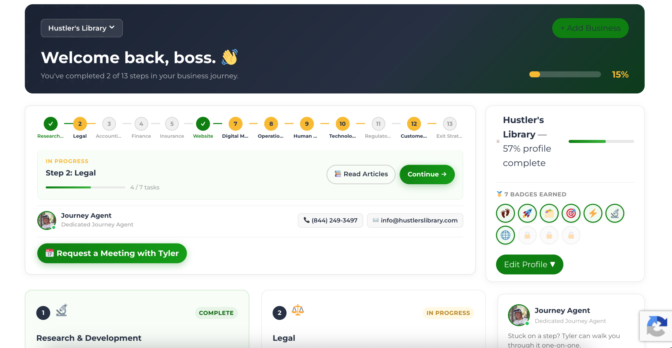
The Business Journey dashboard maps your exact position across all 13 stages. Track your progress, unlock resources for each step, and build with a framework used by thousands of founders at Hustler's Library.
No credit card required · Takes 3 minutes · Personalized to your stage