
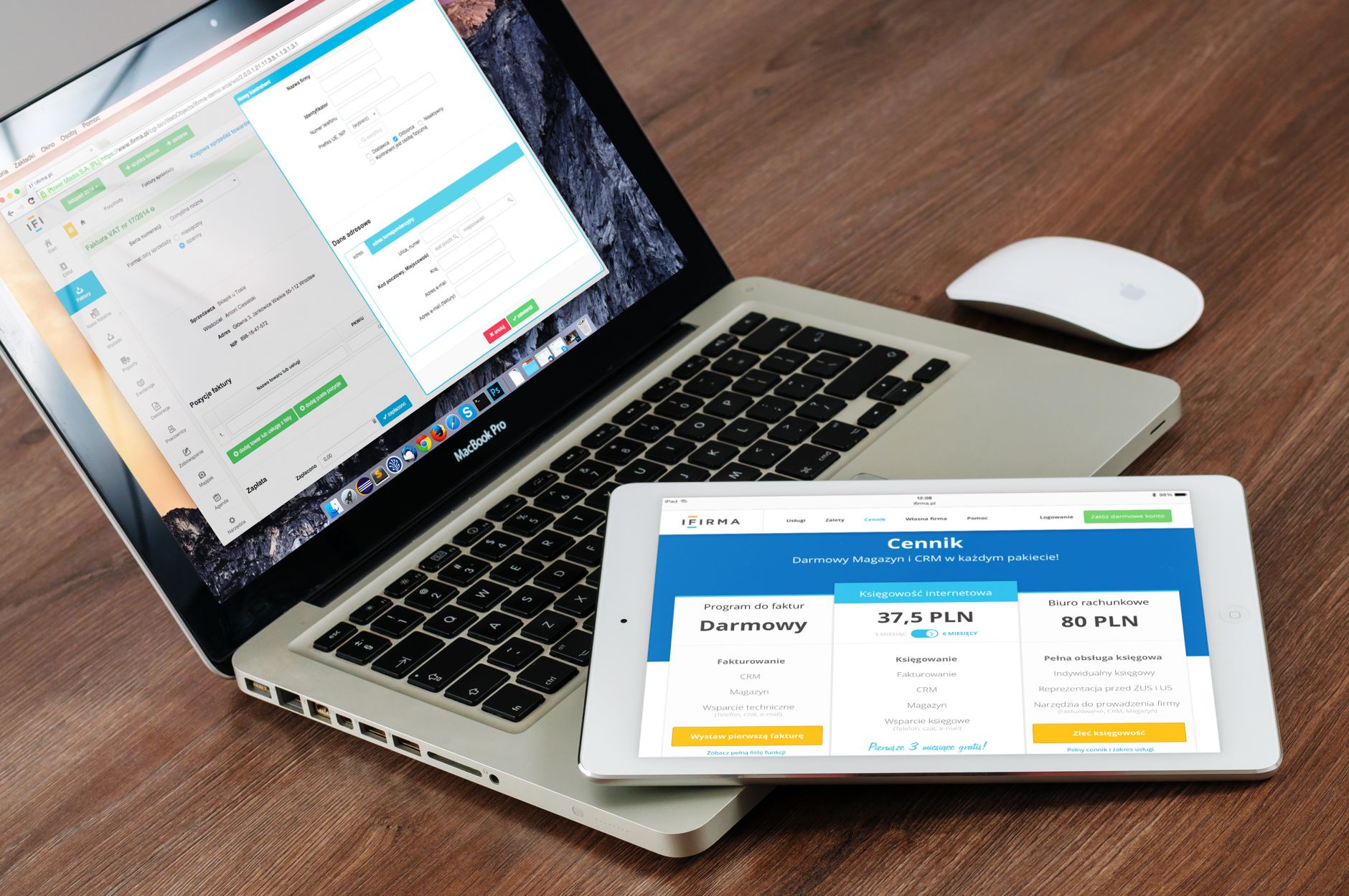
Your website is working right now. The question is whether it’s working for you or against you.
Most small business websites fall into one of two categories: a digital business card that nobody uses, or a genuine sales engine that brings in customers around the clock. The difference between them isn’t budget. It isn’t even design talent. It’s strategy.
This guide walks you through exactly how to build a small business website that converts visitors into leads, customers, and repeat buyers. No jargon, no tech overwhelm. Just a plain-English playbook you can act on today.
Why Most Small Business Websites Don’t Convert
Before we build, let’s diagnose. Here are the most common reasons small business websites fail to turn visitors into customers:
- No clear message. Visitors land on the homepage and still have no idea what the business does or who it’s for.
- No clear next step. There’s no obvious call to action telling the visitor what to do next.
- Slow load times. Over half of mobile users leave a site that takes more than three seconds to load.
- Built for the owner, not the customer. The site is full of features the owner thinks are impressive but the customer doesn’t care about.
- No trust signals. No reviews, no credentials, no photos of real people. It looks anonymous and unverifiable.
Any one of these problems can kill your conversion rate. Several of them together can make your website worse than having no website at all. The good news is that every one of them is fixable.
Step 1: Get Crystal Clear on Your One Core Message
A converting website starts with a converting message. You have about five seconds when someone lands on your homepage to answer three questions in their head: What is this? Is it for me? What do I do next?
Your headline needs to do the heavy lifting here. Instead of something vague like “Welcome to Acme Solutions,” try something like “We Help Restaurant Owners in Phoenix Slash Food Costs Without Sacrificing Quality.” That’s specific, benefit-driven, and immediately filters for the right audience.
A strong website headline follows this formula: [Who you serve] + [What you help them do] + [Key benefit or outcome]. Spend real time on this. It’s the highest-leverage copy on your entire site.
Step 2: Design for Your Customer, Not Your Ego
Small business owners almost always make the same mistake: they design a website that reflects what they find impressive. The customer-centric approach flips this completely.
Start by asking: What does my ideal customer need to know, feel, and believe before they’re ready to buy? Then build your pages around those answers. This is closely connected to building a strong ideal customer profile before you write a single word of copy.
Practically, this means:
- Leading with benefits, not features
- Using language your customers actually use (not industry jargon)
- Showing the outcome of working with you, not just the process
- Putting the customer as the hero, not your business
Step 3: Build a Homepage That Guides, Not Overwhelms
Your homepage is a guided path, not a brochure. Every section should logically flow the visitor toward a single action. Here’s a proven structure that works for most small businesses:
The Hero Section
Your headline, a supporting subheadline, a strong visual, and one call-to-action button. That’s it. No slider, no auto-playing video, no five different options. One button with a clear action: “Get a Free Quote,” “Book a Call,” “Shop Now.”
The Problem You Solve
Briefly name the pain your customer is experiencing. People buy when they feel understood. A few sentences that say “we know you’re dealing with X and Y” goes a long way toward building trust before you’ve said a word about your solution.
Your Solution and How It Works
Now introduce your product or service. Keep it benefit-focused. Explain how it works in three to four simple steps. Clarity beats cleverness every time.
Social Proof
Customer reviews, before-and-after results, recognizable client logos, media mentions, or case study snapshots. According to the SBA’s guide to building your business website, credibility signals are among the most important factors in getting visitors to take action.
The Repeat CTA
Repeat your call to action at the bottom of the page. This time with a bit more urgency or a simple reason to act now: “Book your free 20-minute strategy call. Spots fill fast.”
Step 4: Make Your CTAs Impossible to Miss
Every page of your website should have one primary goal. Every page should have a call to action that supports that goal. This means:
- Use contrasting colors for your CTA buttons so they stand out visually
- Use action verbs: “Get Started,” “Claim Your Spot,” “Download Now”
- Remove competing links and distractions around your CTA
- Test different button text to see what gets more clicks
A confused visitor does nothing. Make the next step so obvious that not clicking would feel strange.
Step 5: Build Trust at Every Touchpoint
Conversion is built on trust. And trust is built through signals, not statements. Anyone can say “we’re the best.” Fewer can show it. Here’s how to build real trust into your site:
- Real photos. Use photos of your actual team, your actual space, your actual work. Stock photos scream “nobody home.”
- Reviews with names and faces. A review with a first name, last initial, and photo converts better than an anonymous one.
- Credentials and certifications. If you have them, show them. Licenses, industry memberships, awards. Every credential removes a reason not to trust you.
- A strong About page. People buy from people. Tell your story. Make it human.
- Transparent contact info. An address, a phone number, a real email. The harder it is to reach you, the less trustworthy you appear.
Step 6: Speed Up Your Site
A slow website is a leaky bucket. You can drive all the traffic you want, but if your pages take more than three seconds to load, you’re losing over half your visitors before they ever see your offer.
The most common culprits are oversized images, too many plugins, cheap shared hosting, and no caching. A few quick wins:
- Compress all images before uploading (tools like TinyPNG are free)
- Use a caching plugin if you’re on WordPress
- Choose a quality hosting provider, not the cheapest option available
- Minimize the number of active plugins
Run your site through Google PageSpeed Insights to see where you stand. Aim for a score above 70 on mobile. Every second you shave off load time has a measurable impact on conversions.
Step 7: Optimize for Mobile First
More than 60 percent of web traffic now comes from mobile devices. If your site looks great on desktop but breaks on a phone, you’re turning away the majority of your visitors.
Mobile optimization means text is readable without pinching and zooming, buttons are large enough to tap with a thumb, forms are short and easy to fill out on a small screen, navigation is clean, and pop-ups don’t take over the entire screen. Most modern website builders handle the basics automatically, but always preview on a real phone before you publish any major changes.
Step 8: Use Data to Keep Improving
A converting website is never finished. The best small business websites get better over time because their owners pay attention to the data and make adjustments.
Install Google Analytics and start tracking which pages get the most traffic, how long people stay, and where they drop off. Use what you learn to iterate. If your pricing page has a high bounce rate, the problem might be your copy, your layout, or your actual price. Data tells you where to look. Understanding how to use heat maps on your website can take your optimization even further, showing you exactly where visitors click, scroll, and disengage.
Even small changes can make a significant difference. Rewriting your main headline, changing the color of your CTA button, adding three customer reviews to your homepage. These are low-cost, high-impact experiments that any small business owner can run without a developer.
Step 9: Keep Your Brand Consistent Across Every Page
Inconsistent branding creates unconscious doubt. When your homepage feels like one company and your contact page looks like a completely different one, visitors notice. They may not know exactly why, but they feel less confident clicking that button.
This is why having a brand style guide is so valuable even for small businesses. Lock down your fonts, your colors, your tone of voice, and your logo usage. Apply them consistently across every page, every image, and every piece of copy on your site. Consistency builds familiarity, and familiarity builds trust.
The Bottom Line
A converting website is not about having the flashiest design or the biggest budget. It’s about clarity, trust, and a friction-free path to action. Get your message right. Design for your customer. Build in trust signals. Speed things up. Stay consistent. Then watch the data and keep improving.
Your website should be your hardest-working team member. It never calls in sick, never asks for a raise, and is selling for you 24 hours a day. Treat it like the business asset it is, and it will pay you back many times over.
Want more plain-English guides to growing your small business? Join thousands of entrepreneurs who get the best strategies, tools, and resources delivered straight to their inbox. Join the Hustler’s Library for free right here.
Ready to Know Where You Stand?
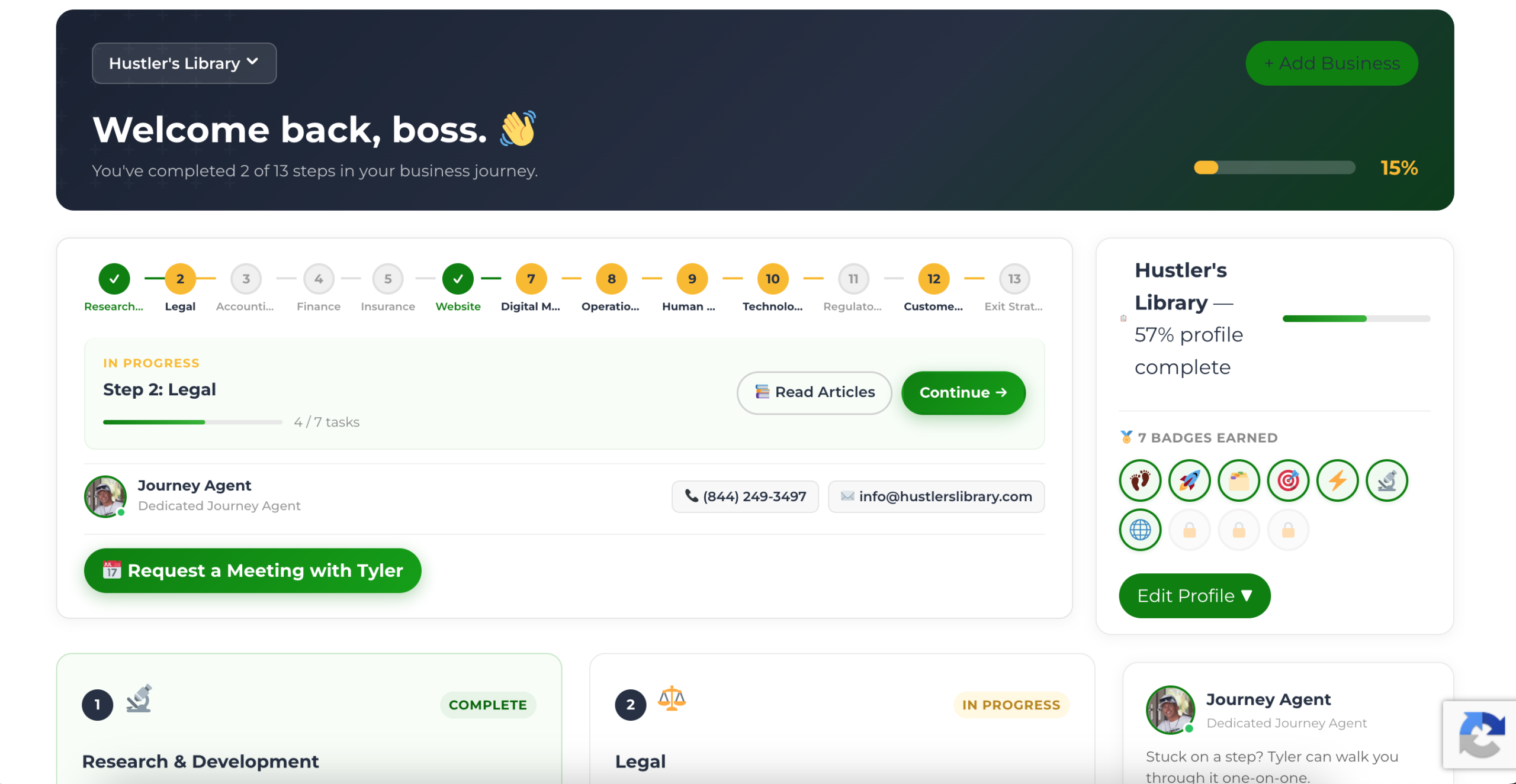
The Business Journey dashboard maps your exact position across all 13 stages. Track your progress, unlock resources for each step, and build with a framework used by thousands of founders at Hustler's Library.
No credit card required · Takes 3 minutes · Personalized to your stage