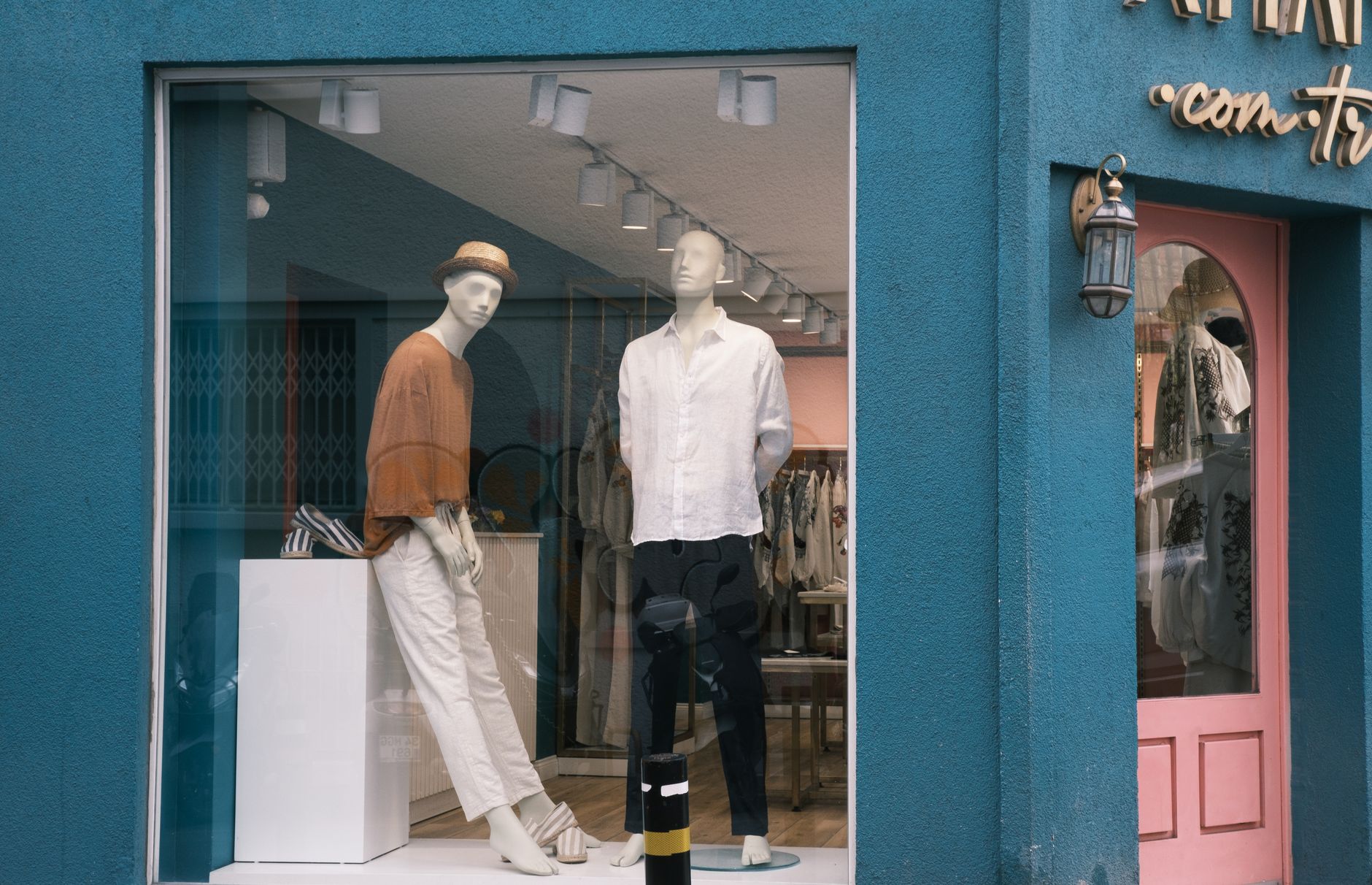
You can have the best product in the world, but if nobody stops to look at it, you’re leaving money on the table. Visual merchandising is the art and science of presenting your products and space in a way that attracts customers, guides their attention, and makes buying feel natural. And while most small business owners think of it as something only big retailers do, the truth is that even a single-location shop, pop-up booth, or service-based storefront can use these principles to sell more without spending more on ads.
This guide breaks down visual merchandising in plain English so you can start applying it today, whether you sell clothing, food, handmade goods, or anything in between.
What Visual Merchandising Actually Is
Visual merchandising covers everything a customer sees, hears, and feels when they enter your space or encounter your display. That includes your store layout, product placement, signage, lighting, color choices, and even how items are grouped together. The goal is simple: make it easy and appealing for people to browse, pick things up, and buy.
Think about the last time you walked into a store that felt inviting and easy to navigate versus one that felt cluttered and overwhelming. The difference is almost always deliberate design decisions, and those decisions directly affect how much customers spend.
Visual merchandising is not just for retail. A salon with a clean, organized product display near the checkout desk sells more products. A food truck with a clear, visually organized menu board sells more of its high-margin items. A service business with a branded waiting area feels more trustworthy and commands higher prices. The principles apply everywhere.
The Decompression Zone: Your First Impression Sets the Tone
When customers walk through your door or approach your booth, they need a moment to transition from the outside world into your space. Retailers call this the decompression zone, and it’s the first five to fifteen feet of your entrance. Whatever you put there will largely be ignored because customers are still mentally adjusting.
The mistake most small businesses make is putting their best merchandise right at the entrance. Instead, use that zone for signage, a simple display, or a welcoming visual. Save your featured products and high-margin items for the area just past the decompression zone where customers are fully engaged and ready to browse.
This concept connects directly to the broader idea of first impressions in business. If your space signals quality and care from the moment someone approaches it, you have already started winning the sale. For more on how this plays out across your entire customer experience, check out our guide on how to use the power of first impressions to win more clients.
Use the Rule of Three
One of the most reliable principles in visual merchandising is the rule of three. Displays arranged in groups of three are more visually interesting and balanced than two or four items. Your eye naturally finds odd-numbered groupings more dynamic and pleasing.
When setting up a product display, group items in threes, vary the height (one tall, one medium, one low), and use props or background elements to add depth. This creates what merchandisers call a focal point, which is a visual anchor that draws the eye and holds attention.
You can apply this at every scale. Three featured products on a countertop. Three promotional signs in a window. Three price tiers on a menu. The rule works because it gives the eye a natural resting place without feeling static.
Guide the Customer’s Eye With Height and Color
Height variation is one of the easiest ways to create visual interest and guide customers through your space. A flat, uniform display is forgettable. A display that moves up and down gives the eye a path to follow, which keeps customers engaged longer.
Color does the same thing. Warm colors like red, orange, and yellow draw the eye from a distance and create energy. Cool colors like blue and green feel calm and trustworthy. Neutral backgrounds make your products pop. If you want a particular item to stand out, put it against a contrasting color rather than a matching one.
A practical approach for small businesses is to identify your one or two highest-margin products or services, then ask yourself: does my display actively point the customer toward those items? If the answer is no, rearranging your visual hierarchy to support your profit goals costs nothing but time.
Signage That Sells
Signs are a form of visual merchandising that most small businesses underuse. A good sign does not just label a product. It answers the question every customer is silently asking: why does this matter to me?
Instead of a sign that says “Organic Candles – $18,” try “Hand-poured with essential oils. Burns for 60 hours. $18.” Instead of “Men’s Haircut – $35,” try “Precision cut, hot towel finish. $35.” The second version sells the experience and the value, not just the price tag.
Keep signs short, readable from a distance, and consistent with your brand’s visual style. Mismatched fonts, hand-scrawled cards, and faded printouts signal low quality, even if your product is excellent. The SBA has useful guidance on marketing your small business that touches on presentation standards worth reviewing.
Cross-Merchandising: Sell More by Selling Together
Cross-merchandising is the practice of grouping complementary products together so customers naturally buy more than they planned to. A barbershop that displays beard oil next to its clippers. A coffee shop that puts travel mugs near the register. A gift shop that arranges cards next to gift wrap next to ribbon.
This works because it makes the buying decision easier. The customer does not have to remember to ask for a recommendation or search for the add-on. You have already made the connection for them visually.
The key is to make the connection logical and obvious. If the pairing requires an explanation, it probably is not working as well as it could. The best cross-merchandising moments feel like a service to the customer, not a sales tactic.
Lighting Changes Everything
Lighting is the single most underrated tool in small business visual merchandising. The right lighting makes products look better, creates atmosphere, and influences how long customers stay in your space. The wrong lighting makes everything look flat, cheap, or uninviting.
Warm white lighting (around 2700 to 3000 Kelvin) creates a cozy, inviting feel and works well for boutiques, food businesses, and wellness spaces. Cool white lighting (above 4000 Kelvin) feels clean and energetic and suits tech, fitness, and professional service environments.
If you have featured products or a hero display, use directional lighting to spotlight them. Even a simple clip-on LED spotlight can dramatically increase the visual pull of a display and is inexpensive to set up.
Rotate Your Displays Regularly
Regular customers stop seeing things that never change. A display that was eye-catching three months ago has become invisible to anyone who visits you more than once. Rotating your displays, even small changes, signals freshness and gives returning customers a reason to look again.
You do not need to redesign your entire space every week. Swap the featured product, change the color accent, update the signage, or rearrange the groupings. Small updates, done consistently, keep your space feeling alive and current.
Tie display changes to seasons, holidays, local events, or business promotions. This gives you a natural rhythm and connects your visual presentation to what is already on your customers’ minds. For deeper insight into how local context can drive foot traffic and engagement, read our guide on how to use neighborhood marketing to win more local customers.
Apply These Principles Beyond a Physical Store
Visual merchandising is not limited to brick-and-mortar. If you sell online, your product photography, page layout, and product sequencing are all forms of visual merchandising. The same principles apply: guide the eye, use contrast to highlight what matters, group complementary items, and make buying easy.
At a pop-up event or market, your table setup is your store. The height variation, the focal point, the signage, the lighting you bring with you, all of it signals whether you are a serious business worth spending money with or just someone with a folding table.
If you have staff or brand representatives who interact with customers, their appearance and how they engage with the space is also part of your visual story. Building a team that understands and reinforces your brand’s look and feel is worth the investment. Our guide on how to build a brand ambassador program walks through how to create that alignment formally.
Start With One Display
You do not need to overhaul your entire space to see results. Pick one area, your entrance, your checkout counter, your best-selling product’s display, and apply the principles above deliberately. Group items in threes, vary the height, improve the lighting, update the signage, and make a logical cross-merchandising connection.
Watch what happens. Do customers stop there? Do they pick things up? Do they ask about items they previously ignored? Use what you observe to guide the next improvement. Visual merchandising is an ongoing process, not a one-time project.
The businesses that get this right are not always the ones with the biggest budgets. They are the ones that pay attention to how their space communicates and keep refining the message.
Ready to Go Further?
Visual merchandising is just one lever for growing your small business. If you want access to more practical, no-fluff guides like this one, built specifically for small business owners who are serious about growth, join the Hustler’s Library community for free.
Join Hustler’s Library for free here.
Ready to Know Where You Stand?
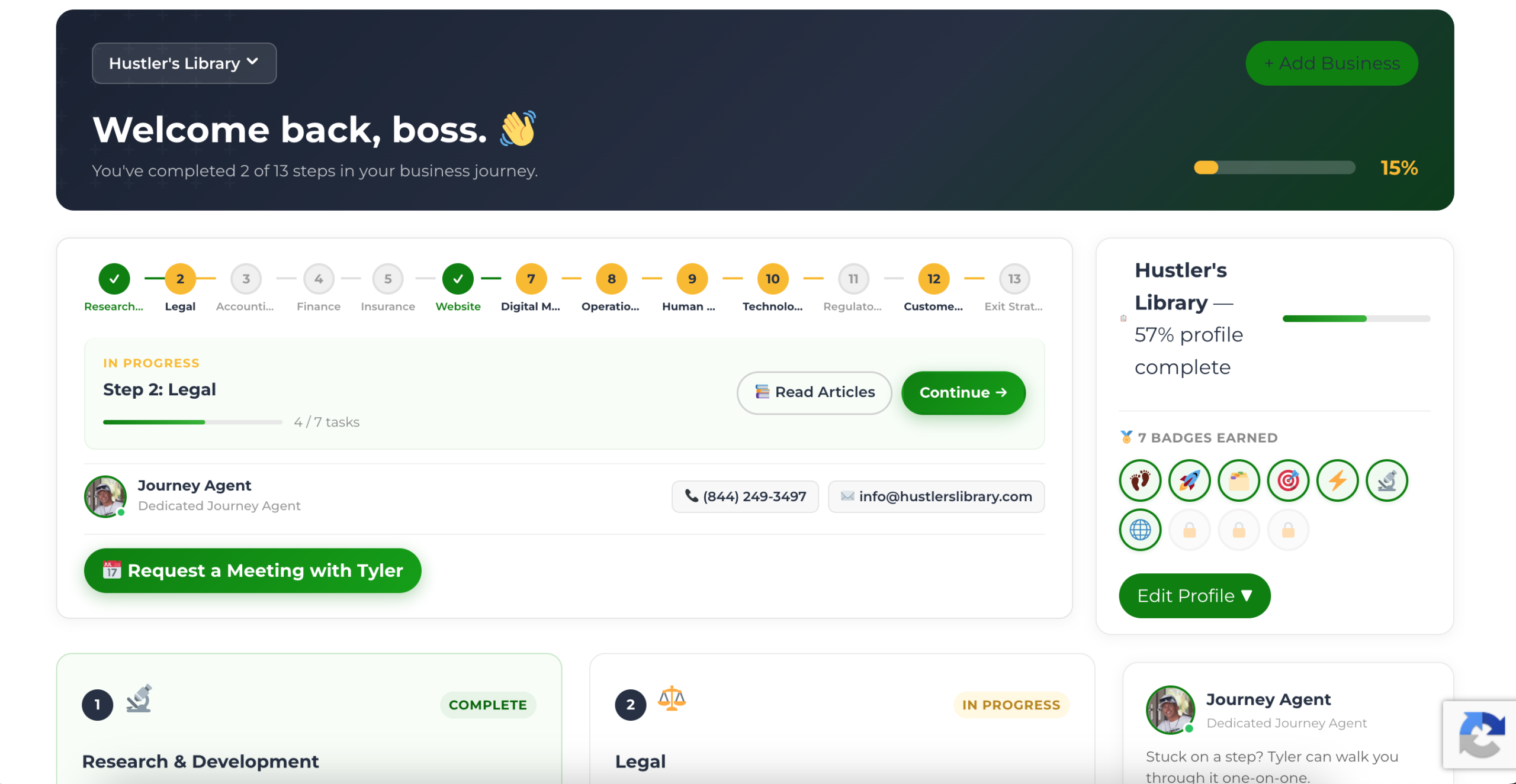
The Business Journey dashboard maps your exact position across all 13 stages. Track your progress, unlock resources for each step, and build with a framework used by thousands of founders at Hustler's Library.
No credit card required · Takes 3 minutes · Personalized to your stage