You walk into a fast-food restaurant and everything is red and yellow. You log into a banking app and it’s all navy blue and white. You buy organic produce and the packaging is green with earthy tones. None of that is an accident.
Color is one of the most powerful and underused tools in small business marketing. Research consistently shows that color increases brand recognition by up to 80 percent, and that consumers make a subconscious judgment about a product within 90 seconds of first viewing it. Up to 90 percent of that snap judgment is based on color alone.
If you’re a small business owner who picked your logo color because it looked cool or matched your website template, you’re leaving money on the table. This guide will break down what color psychology actually means, how it applies to your business, and how to use it intentionally to attract more customers and build a stronger brand.
What Is Color Psychology?
Color psychology is the study of how colors affect human perception, emotion, and behavior. Different colors trigger different emotional responses, and those responses influence how people feel about your brand, your products, and your business as a whole.
This isn’t just theory. Major brands spend millions of dollars testing color combinations to maximize emotional impact. As a small business owner, you don’t need a massive budget to apply these same principles. You just need to understand the basics and make intentional choices.
The Core Colors and What They Communicate
Here’s a plain-English breakdown of what the major colors signal to customers:
Red: Urgency, Energy, Appetite
Red grabs attention and triggers urgency. It’s why clearance sales use red tags and why fast-food chains favor it. Red also stimulates appetite, which is why it dominates the restaurant industry. For small businesses, red works well for calls to action, limited-time offers, and brands that want to convey passion or energy.
Blue: Trust, Reliability, Calm
Blue is the most universally liked color in the world and the go-to for brands that want to signal trustworthiness. Banks, insurance companies, and tech firms lean heavily on blue. If your business deals with finances, legal services, healthcare, or anything where trust is the primary selling point, blue is your friend.
Green: Growth, Health, Nature
Green signals health, sustainability, and money. Wellness brands, organic food companies, and eco-friendly businesses use green to reinforce their values. It’s also associated with financial growth, which is why many wealth management brands incorporate green into their identity.
Yellow: Optimism, Warmth, Caution
Yellow is energetic and attention-grabbing. It communicates optimism and warmth, which is why it’s common in retail and hospitality. But use it carefully. Too much yellow can cause anxiety or feel cheap. It works best as an accent color alongside a more grounding primary color.
Black: Luxury, Authority, Sophistication
Black conveys power, elegance, and premium quality. High-end fashion, tech products, and luxury brands use black to signal exclusivity. If you’re positioning your business as a premium option and want to justify higher prices, black can help anchor that perception.
Orange: Enthusiasm, Creativity, Affordability
Orange is friendly, energetic, and approachable. It sits between red and yellow, capturing both urgency and warmth without the aggression of pure red. Brands like Amazon, Harley-Davidson, and Home Depot use orange to signal value, enthusiasm, and forward movement. It’s a good choice for service businesses that want to feel approachable but not boring.
Purple: Creativity, Wisdom, Royalty
Purple has historically been associated with royalty and wealth, which makes it effective for brands targeting an upscale or creative audience. It’s commonly used in beauty, wellness, and creative industries. Lighter purples feel more soothing and feminine, while deeper purples feel more authoritative and premium.
Where Color Decisions Actually Matter
Color psychology isn’t just about your logo. Every customer touchpoint is an opportunity to reinforce your brand message through color. Here’s where it matters most:
Your Logo and Brand Identity
This is the foundation. Your logo colors set the emotional tone for your entire brand. Before you finalize or refresh your logo, think about what emotion you want customers to feel when they see it. Reliable? Exciting? Trustworthy? Premium? Let that emotion guide your color choice, not just personal preference.
Your Website
Background color, button color, header color, and text contrast all influence how long visitors stay and whether they take action. Studies show that changing a call-to-action button color can increase conversions by 20 to 30 percent. This is one of the lowest-effort, highest-return optimizations available to small business websites. When you’re building out your high-converting landing page, color choices should be part of the conversation from the start.
Packaging and Physical Materials
If you sell physical products or operate a physical location, color extends to your packaging, signage, uniforms, and store interior. Retail research shows that 85 percent of shoppers cite color as a primary reason for buying a product. Packaging that uses color strategically communicates quality and value before the customer even reads the label.
Marketing and Advertising
Your social media graphics, email templates, print ads, and digital banners should all maintain color consistency. When you create your small business marketing budget, factor in the cost of professional design that maintains color consistency across all channels. Inconsistent color usage confuses customers and erodes brand recognition.
How to Choose the Right Colors for Your Business
Here’s a practical process for making intentional color choices:
Step 1: Define Your Brand Personality
Write down three to five adjectives that describe how you want customers to feel when they interact with your brand. Trustworthy. Bold. Friendly. Premium. Energetic. These adjectives are your filter. Every color decision should pass through them.
Step 2: Research Your Industry
Look at the dominant colors in your industry. Then decide whether you want to fit in or stand out. In some industries, aligning with the category convention builds instant trust (blue for finance). In others, going against the grain helps you stand out in a crowded market (using black in an industry where everyone uses pastels).
Step 3: Consider Your Target Customer
Color perception varies by age, culture, and gender. Research shows women tend to prefer softer tones while men lean toward bolder shades, though this varies significantly. Older audiences may respond differently to colors than younger ones. If you’ve built a strong customer persona, use it to inform your color choices rather than making assumptions based on your own taste.
Step 4: Build a Simple Color Palette
Most strong brand palettes use three to four colors: a primary color, one or two secondary colors, and a neutral. Limit your palette intentionally. More colors don’t mean more impact. A tight, consistent palette is more memorable and easier to apply across every customer touchpoint.
Step 5: Test Before You Commit
Before redesigning your entire brand, test your color choices. Create two versions of a social media graphic or landing page with different color schemes and see which one performs better. A/B testing color is free and takes an afternoon. It can save you from a rebrand that doesn’t land.
Common Color Psychology Mistakes Small Business Owners Make
Avoiding these errors can immediately sharpen your brand presence:
- Choosing colors based on personal preference instead of brand strategy. What you like and what your customers respond to are often different things.
- Using too many colors. More than four primary brand colors creates visual chaos and weakens recognition.
- Ignoring contrast. Low-contrast text and background combinations hurt readability and accessibility. The Americans with Disabilities Act guidelines recommend a minimum 4.5:1 contrast ratio for normal text.
- Inconsistency across channels. Your logo should be the same shade of blue on your website, your business cards, and your Instagram profile. Use hex codes, RGB values, and Pantone numbers to maintain consistency.
- Ignoring cultural context. If you serve international customers, be aware that color meanings vary by culture. White signals purity in Western markets but mourning in some Eastern cultures. Red means luck in China but danger in the West.
Quick Wins You Can Implement This Week
You don’t have to do a full rebrand to start using color psychology. Here are four things you can do right now:
- Audit your current brand colors. Write down what emotion you intended them to communicate. Then ask a few customers what they actually feel when they see your branding. The gap between the two is your opportunity.
- Change your call-to-action button color on your website. If your button is gray or blends into the background, switch to a high-contrast color like orange, red, or green. Monitor conversions for two weeks.
- Standardize your color palette. Document your exact hex codes and apply them consistently across all marketing materials going forward.
- Look at your competitors’ colors. If three of your top four competitors all use blue, consider whether using a different color might help you stand out rather than blend in.
The Bottom Line
Color is a business tool, not a design preference. The most successful brands in the world treat color as a strategic asset that communicates brand values, triggers emotions, and drives customer behavior. As a small business owner, you have access to the same principles. You just have to use them on purpose.
Start with your brand adjectives, pick colors that match, and apply them consistently across every place a customer sees your business. That consistency builds recognition, recognition builds trust, and trust builds revenue.
According to the U.S. Small Business Administration, investing in your brand identity is one of the highest-return activities a small business can undertake. Color is the most visible part of that identity.
Ready to level up your entire business strategy? Join thousands of small business owners who get weekly guides, tools, and insights at Hustler’s Library. It’s free.
Ready to Know Where You Stand?
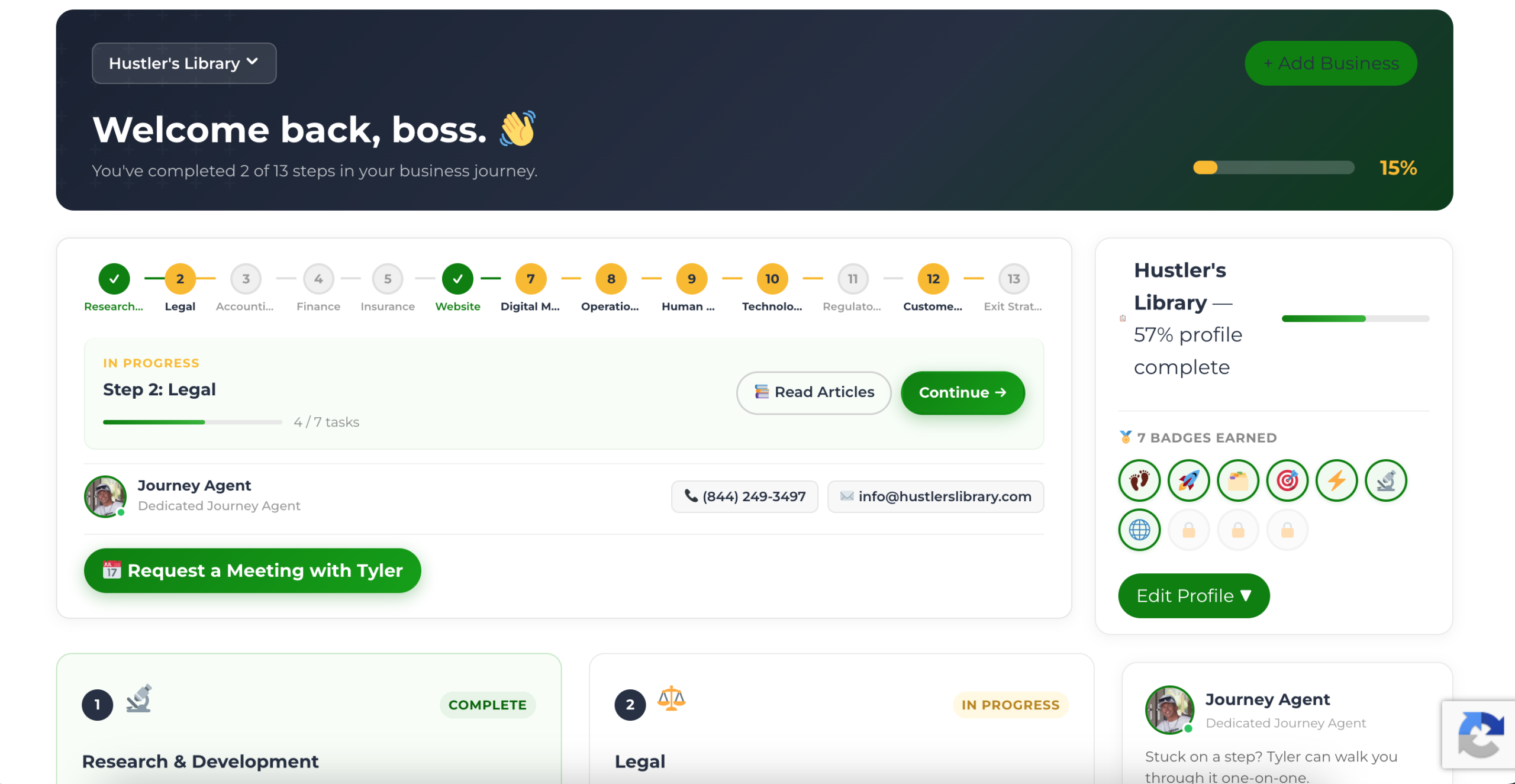
The Business Journey dashboard maps your exact position across all 13 stages. Track your progress, unlock resources for each step, and build with a framework used by thousands of founders at Hustler's Library.
No credit card required · Takes 3 minutes · Personalized to your stage